8 December 2016

Drawing Session 11

From 07/11

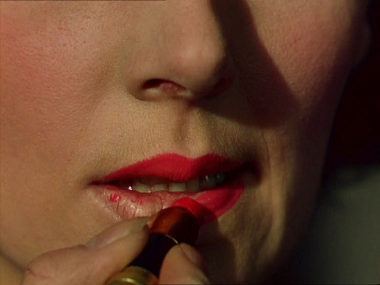
We didn't have a model today, so we looked at stills from Alfred Hitchcock's 'The Birds' (1963). We also looked at the scene slowed down, and how it changed the mood of the scene and the way the story reads.


I'm right handed but I drew these with my left, I wanted to see how it would turn out and I found that it meant I had to think a bit longer before I made each mark. I think it helped me with getting lights and darks down a bit better, even if they weren't as accurate. Sometimes I draw too quickly and without thinking, having to slow down changed the experience quite a bit.

Drawing Session 10

From 30/11

This session was focussed on lighting.


Drawing Session 9

From 23/11


28 November 2016

Black Narcissus, 1947

Fig. 1 Poster
Michael Powell and Emeric Pressburger's 'Black Narcissus' (1947) is a British melodrama with a key focus on female sexuality. This is a topic that was taboo at the time it was made and is still rarely explored with much depth today. At the time of the film's release, Thomas M. Pryor, writing for the New York Times, noted that the film would 'disturb and antagonise some' (Pryor, 1947). Powell and Pressburger, known as The Archers, made the film shortly after World War II ended; this was a very good time for British cinema, the constraints of war time were lifted and filmmakers had higher budgets and more creative freedom (Mirasol, 2010). The film follows the story of a small group of nuns who are invited to set up a school and hospital in the disused and rundown Palace of Mopu, a place that once housed harem ladies. The plot follows these women as they are negatively affected by their environment and come to question their dedication to the Order they belong to.

Designed by Alfred Junge, a regular collaborator on films by Powell and Pressburger, the entire film was shot in England, with almost all of it shot at Pinewood Studios, and a small part of the film - the gardens - shot at Leonardslea in West Sussex (Howells, 2011). Matte painting was used to create the backdrop for the film, which is set in the Himalayas of India. The differences between Fig. 2 and Fig. 3 show just how much of the landscape seen in the film was produced through this technique. The effect is incredible, and, according to Peter Bradshaw, writing in 2005, 'the sets and backdrops are superbly and still convincingly rendered' (Bradshaw, 2005).


Fig. 2 Integrated Matte Painting
Fig. 3 Behind the Scenes
The filmmakers use set design to enhance the harshness of the plot and its brutally cold mountain top setting. The difficult weather is used to represent the coldness that anyone might feel coming to a new place where things will be difficult and people likely hostile. This is continued as the tensions in the film come to a head, with a scuffle between the Sister Superior, Sister Clodagh, and a troubled member of her group, Sister Ruth. During this scene, that takes place in the same spot as the scene shown in Fig. 2, a different matte painting is used, and the heavy cloud cover, seen in Fig. 4, is cleverly representative of the conflict the nuns are feeling amongst and within themselves.

Fig. 4 The Confrontation
The cruelty of the environment the nuns have come to is also felt through the crooked and cramped design of the palace. In the book 'British Film Design: A History', Laurie N. Ede writes that the Junge's designs 'expressed marvellous contrasts between the ordered world of the convent of the order of St Mary and the house at Mopu' (Ede, 2010:54) Throughout the film many things are placed in opposition to highlight and create tensions. The interior walls of the palace depict sexual scenes with many naked women; these frescos are in the background of the all of the nuns' activities and serve to create constant conflict with the pure and functional mission of the nuns.

Fig. 5 Intense Lighting
Powell and Pressburger make use of red and blue to represent conflicts between sexuality and chastity, madness and stability, and warmth and cold. They do this through lighting techniques and the colours in the physical set. The tension in the film builds and, as the nuns are driven further mad by their environment, the contrast in the lighting grows. More and more red is used as the film goes on and the mood of the film and its set is entirely different at its end than at its start. This change happens so smoothly that its only as the film approaches its climax, with the changes increasing in pace, that it becomes obvious. Fig. 5 shows the powerful changes that lighting makes to the plain white uniform of Sister Clodagh.

Fig. 6 The Nuns
Carefully chosen costumes are effective in separating the nuns from those they have come to live with. The nuns wear a very conservative white uniform (as seen in Fig. 6), making it difficult to separate them from one another, and easy to pick out from those outside of their order. This uniform represents their purity and contrasts greatly with the colourful outfits worn by the local people. These uniforms are in greatest contrast with those worn by the men in the film, highlighting the sexual frustrations in the film. The Young General wears incredibly lavish clothing, and Mr Dean often wears hardly anything at all.

Fig. 7 Sister Ruth and Mr Dean
Mr Dean is the object of Sister Ruth's affections and it becomes an obsession, with the conflict between her vows and her sexual desires driving her mad. Fig. 7 shows the difference in costume and Sister Ruth's sexual attraction to Mr Dean. There is a very intense scene in the film, in which Sister Ruth applies red lipstick, as Sister Clodagh looks on in horror, clutching her bible. The camera closes in on Sister Ruth's mouth (as seen in Fig. 8), and, particularly with red makeup intended to mimic the flush of arousal, the scene is very sexually charged. It is described by Michael Howells, writing for BAFTA Guru, as 'spellbinding' (Howells, 2011). Choice of colours can have a great impact on a film, and the use of Technicolour in this film is incredibly important for showing the many contrasts that Powell and Pressburger create through the use of colour.

Fig. 8 Red Lipstick

Bibliography

Bradshaw, P (2005). Black Narcissus. At: https://www.theguardian.com/theguardian/2005/aug/05/3 (Accessed on 26.11.16)

Ede, L (2010). British Film Design: A History. London: I.B. Tauris & Co Ltd. [Online] At: https://books.google.co.uk/books?id=7633AgAAQBAJ&pg=PA54&lpg=PA54&dq=black+narcissus+set+design&source=bl&ots=0TxvgDP_-B&sig=Mth9uxm87knOkBELs6_iU_lWZpY&hl=en&sa=X&ved=0ahUKEwj_sIv9qavQAhVFI8AKHVJSDEw4ChDoAQg4MAY#v=onepage&q&f=false (Accessed on 26.11.16)

Howells, M (2011). Behind the Mask: Production Design in Black Narcissus. At: http://guru.bafta.org/behind-mask-production-design-black-narcissus (Accessed on 26.11.16)

Mirasol, M (2010). "Black Narcissus," Which Electrified Scorsese. At: http://www.rogerebert.com/far-flung-correspondents/black-narcissus-which-electrified-scorsese (Accessed on 26.11.16)

Pryor, T (1947). Black Narcissus. At: http://www.nytimes.com/movie/review?res=EE05E7DF173CE261BC4C52DFBE66838C659EDE (Accessed on 26.11.16)

Illustration List

Fig. 1 Poster
Powell, M and Pressburger E (1947). 'Black Narcissus'. [Poster] At: http://assets.flicks.co.nz/images/movies/poster/70/70afbf2259b4449d8ae1429e054df1b1_500x735.jpg (Accessed on 26.11.16)

Fig. 2 Integrated Matte Painting
Powell, M and Pressburger E (1947). 'Black Narcissus'. [Film Still] At: https://blogger.googleusercontent.com/img/b/R29vZ2xl/AVvXsEjWJ5zi45Nu__QKrkzRBKLLUcffNSP0Onz0x3bTqBYxeh839ByDD4jds7-3VwowPqbjDI3GjIm638QPu_wV9oKQHt8o8_a_opNw3owuPr0js8vENlogu2NjLnpKTTFIu_vLEGwD2ni65ok/s1600/black-narcissus.jpg (Accessed on 26.11.16)

Fig. 3 Behind the Scenes
Powell, M and Pressburger E (1947). 'Black Narcissus'. [Behind the Scenes Photgraph] At: http://theredlist.fr/media/database/settings/cinema/1940-1950/the-black-narcissus/007-the-black-narcissus-theredlist.jpg (Accessed on 26.11.16)

Fig. 4 The Confrontation
Powell, M and Pressburger E (1947). 'Black Narcissus'. [Film Still] At: https://www.berlinale.de/media/filmstills/2015_1/retrospektive_11/201520114_4_IMG_FIX_700x700.jpg (Accessed on 26.11.16)

Fig. 5 Intense Lighting
Powell, M and Pressburger E (1947). 'Black Narcissus'. [Film Still] At: http://theredlist.fr/media/database/settings/cinema/1940-1950/the-black-narcissus/007-the-black-narcissus-theredlist.jpg (Accessed on 26.11.16)

Fig. 6 The Nuns
Powell, M and Pressburger E (1947). 'Black Narcissus'. [Film Still] At: http://networkonair.com/features/wp-content/uploads/2014/07/blacknarcissus01.jpg (Accessed on 26.11.16)

Fig. 7 Sister Ruth and Mr Dean
Powell, M and Pressburger E (1947). 'Black Narcissus'. [Film Still] At: https://s-media-cache-ak0.pinimg.com/736x/1d/d6/ba/1dd6baec2b90d28613a3c832c5226b8f.jpg (Accessed on 26.11.16)

Fig. 8 Red Lipstick
Powell, M and Pressburger E (1947). 'Black Narcissus'. [Film Still] At: http://image.glamourdaze.com/2012/09/1940s-lipstick-Kathleen-Byron-in-Black-NarcissusB.jpg (Accessed on 26.11.16)

Maya: Old Alley UV


WIM Concept Painting and Breakdown


27 November 2016

Organic Modelling Unfinished

I have finished the first 4 videos, but I am having problems with the UV mapping. I've tried to work through this myself but have been unsuccessful.


22 November 2016

WIM 106-107

106
107

I think thumbnail 107 will be my final composition, I will do some colour keys, and hopefully I will then begin painting.

20 November 2016

WIM 90-95

90-93
Some Colour Ideas

94
A view from a path leading to a greenhouse

95
An edit on a previous thumbnail, to push the train line into the image

WIM 89

89

I wanted to post this one thumbnail before I carry on working, as I feel its the closest I've got to the 'mood' I'm trying to create. I would probably push the train line further back into the image, and the building on the left.

After Effects to Maya: Cube Animation