I have enjoyed this project very much. I am pleased with my work, I was worried at several points that it was going to turn out very bad, but some of the progress stages were just awkward and it was good to see the ideas in my head show through towards the end. I really enjoyed learning about textures and lighting and it was very interesting to see how much different textures affect a scene.
I misinterpreted the brief originally and made some very strange depressingly grey thumbnails. In future I will try my best to understand the brief more fully before I throw too much time into the work. I am also going to work on my time and project management, as I let myself down a bit with the slow periods in my workflow.
I have learnt a lot from this project and am excited to put this knowledge to use in future work.

Ellie Row, Computer Animation Arts, UCA Rochester
Showing posts with label Space and Environment. Show all posts
Showing posts with label Space and Environment. Show all posts
20 January 2017

19 January 2017


18 January 2017
The Cook, The Thief, His Wife & Her Lover, 1989
 |
| Fig. 1 Poster |
The wife Georgina is abused by her husband Albert and finds herself drawn to another man named Michael. Their relationship is doomed and not long after they are discovered Albert has his men torture Michael to death. This violent and cruel act is one of many Albert inflicts on those around him, both during the film and in events occurring before its start, but it seems that this is the final straw for Georgina and she plans the ultimate revenge. Ebert comments that her 'character transformation is almost frightening' (Ebert, 1999). She grows in strength throughout the film, though she seems exhausted for much of it, and Greenaway ends the film strongly with her revenge.
 |
| Fig. 2 The Red Dining Room |
 |
| Fig. 3 The White Bathroom |
 |
| Fig. 4 Different Lighting |
Bibliography
Ebert, R (1999) The Cook, The Thief, His Wife & Her Lover. At: http://www.rogerebert.com/reviews/the-cook-the-thief-his-wife-and-her-lover-1999 (Accessed on 04.01.17)
James, C (1990) Review/Film; Peter Greenaway's Elegant and Brutal 'Cook'. At: http://www.nytimes.com/movie/review?res=9C0CE4DE1F3DF935A35757C0A966958260 (Accessed on 04.01.17)
Travers, P (1990) The Cook, The Thief, His Wife & Her Lover. At: http://www.rollingstone.com/movies/reviews/the-cook-the-thief-his-wife-and-her-lover-19900406 (Accessed on 04.01.17)
Wert, W (1990) 'Review: The Cook, the Thief, His Wife and Her Lover by Peter Greenaway, Kees Kasander' In: Film Quarterly 44 (2) p. 45 [Online] At: https://www.jstor.org/stable/1212658?seq=4#page_scan_tab_contents (Accessed on 04.01.17)
Illustration List
Fig. 1 Poster
Greenaway, P (1989) The Cook, The Thief, His Wife & Her Lover [Poster] At: http://www.joblo.com/posters/images/full/1990-the-cook-the-thief-his-wife-and-her-lover-poster2.jpg (Accessed on 18.01.17)
Fig. 2 The Red Dining Room
Greenaway, P (1989) The Cook, The Thief, His Wife & Her Lover [Film Still] At: http://25.media.tumblr.com/tumblr_m1k8duTW7h1qmf7lmo1_1280.png (Accessed on 18.01.17)
Fig. 3 The White Bathroom
Greenaway, P (1989) The Cook, The Thief, His Wife & Her Lover [Film Still] At: http://dazedimg.dazedgroup.netdna-cdn.com/786/azure/dazed-prod/1060/9/1069891.jpg (Accessed on 18.01.17)
Fig. 4 Different Lighting
Greenaway, P (1989) The Cook, The Thief, His Wife & Her Lover [Film Still] At: http://i.imgur.com/TzP1g3Q.jpg (Accessed on 18.01.17)
17 January 2017
Suspiria, 1977
 |
| Fig. 1 Poster |
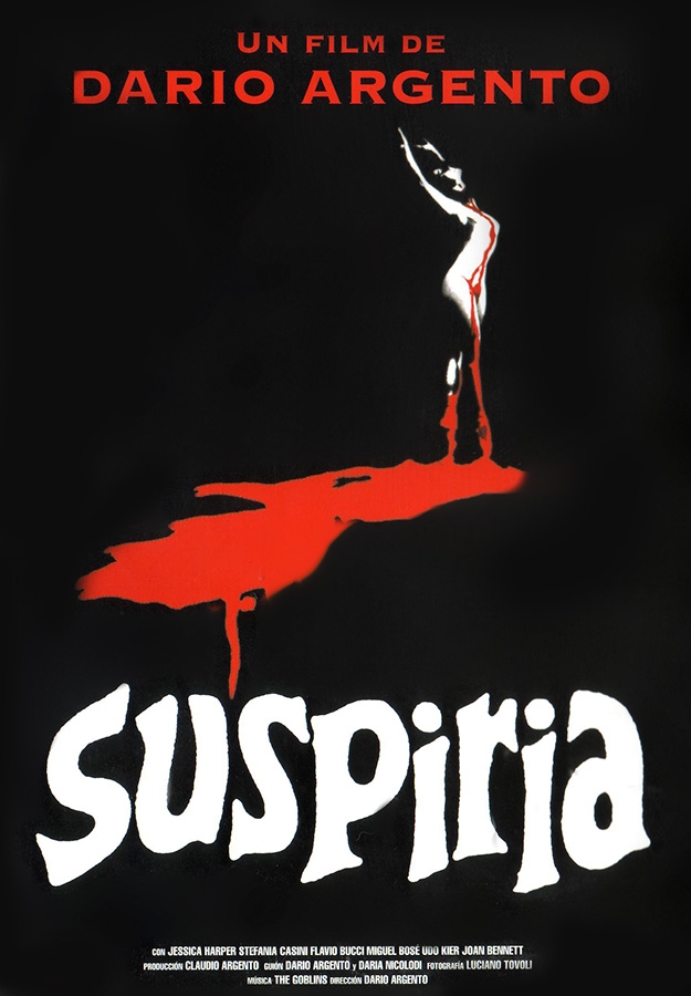
The makers of the film had inspiration from classic fairy tale sources (Gonzalez, 2001) and this can be seen reflected in the bright colours and recognisable character tropes used. Ed Gonzalez, writing for Slant Magazine, commented that 'Just as Madame Blanc and Miss Tanner are the picture-perfect renditions of evil stepmothers, the school's attendees bring to mind Cinderella's bitchy stepsisters' (Gonzalez, 2001). The story has a strange plot, and it seems that Argento made the film to show off his production design skills and really push the boundaries with set and sound design. Argento plays with colours and sound to confuse and excite the audience, creating something that Adam Smith, of Empire Online, aptly describes as a 'unique, surreal, hyper-intense mood' (Smith, 2015).
 |
| Fig. 2 Red |
 |
| Fig. 3 Green |
 |
| Fig. 4 The Airport |
 |
| Fig. 5 The Academy |
Bibliography
Gonzalez, E (2001) Suspiria. At: http://www.slantmagazine.com/film/review/suspiria (Accessed on 04.01.17)
MacCormack, P (2008) Cinesexuality. London: Ashgate. [Online] At: https://books.google.co.uk/books?id=CmE3DAAAQBAJ&pg=PA26&dq=suspiria+1977&hl=en&sa=X&ved=0ahUKEwi6lpj77qjRAhVCfhoKHVAbDvE4ChDoAQgfMAE#v=onepage&q&f=false
Smith, A (2015) Suspiria Review. At: http://www.empireonline.com/movies/suspiria/review/ (Accessed on 04.01.17)
Twells, J (2014) “Suspiria is the masterpiece of Goblin”: Claudio Simonetti on the best horror soundtrack of all time. At: http://www.factmag.com/2014/10/31/suspiria-is-the-masterpiece-of-goblin-claudio-simonetti-reflects-on-the-best-horror-soundtrack-of-all-time/ (Accessed on 04.01.17)
Illustration List
Fig. 1 Poster
Argento, D (1977) Suspiria [Poster] At: http://civilianglobal.com/images/sized/suspiriaposter_625_900.jpg?c2336f (Accessed on 17.01.17)
Fig. 2 Red
Argento, D (1977) Suspiria [Film Still] At: https://s-media-cache-ak0.pinimg.com/originals/6d/a9/50/6da9501cb039cc556bd6b93a80cbce69.jpg (Accessed on 17.01.17)
Fig. 3 Green
Argento, D (1977) Suspiria [Film Still] At: https://stillsfrmfilms.files.wordpress.com/2013/11/272.jpg (Accessed on 17.01.17)
Fig. 4 The Airport
Argento, D (1977) Suspiria [Film Still] At: https://blogger.googleusercontent.com/img/b/R29vZ2xl/AVvXsEijeDDexcJBsnZ3o1q_9PiJI51v4LMzPWN_O3IJzxZYJRWU0Rntou5QW8kbUlTP7Up-xN_Kam2pZZ0E2XdZfLS-l5dA1I7AYgOPfkRIgignspXUI8lauX7AkzViMNkeWjFH81YQxGCF_u0/s1600/Suspiria+3.jpg (Accessed on 17.01.17)
Fig. 5 The Academy
Argento, D (1977) Suspiria [Film Still] At: https://blogger.googleusercontent.com/img/b/R29vZ2xl/AVvXsEheXkTXEacxirWEEHIY4e8t5WUA4cY9qq1XR3Th_qLh0uzAmHTnG86lnKJxFhvMbDq3jDVoPWClxbEK5UUBI7XtK1RYgd4fN4Bd38qEnVrWxyvf_2hDtRBglDvz6DLH8V0yR7x8LEgkIjrR/s1600/DanceAcademy1_Suspiria.jpg (Accessed on 17.01.17)
12 January 2017
The Shining, 1980

Fig. 1 Poster
Stanley Kubrick's 'The Shining' (1980) is a horror film with themes of madness and isolation. It follows the story of the Torrance family as they travel to the Overlook Hotel, when Jack takes a position as winter caretaker. Jack, Wendy, and their son Danny are to spend the winter alone, as the hotel becomes inaccessible in the colder months. Fig. 2 shows the family on their way to the hotel, there is tension in the scene and the characters all seem annoyed with one another. Roger Ebert comments that 'There is no sense that the three function together as a loving family' (Ebert, 2006) and this produces a quiet tension right from the start of the film, as the audience wonders how the family will cope with their isolation.

Fig. 2 The Family
The family have a literal physical isolation to contend with, which could be difficult enough, but the nature of the place they find themselves in adds to their difficulties. The set is made up of large spaces, high ceilings and a repetitive and confusing layout. Ryan Lambie comments that 'The set generates tension not through claustrophobia and dark spaces, but with high ceilings and lonely expanses' (Lambie, 2016). The characters are lost in this space and, rather than creating an open feeling, the high ceilings seem to sit heavily above them, showing them to be small and alone. Fig. 3 shows Jack sat in the lounge, completely dwarfed by the size of the room; big chairs, tables, and light fixtures add to this effect. Kubrick’s heavy use of one point perspective also helps to create this feeling, as long hallways seem to press in on all sides.

Fig. 3 Jack in the lounge
Kubrick’s use of the recently invented Steadicam allowed for smooth and sweeping shots and Eric Henderson of Slant Magazine describes the cinematography as 'gliding, prowling' (Henderson, 2007). This is particularly effective in a scene with the camera closely following Danny as he explores the long hallways on his trike; there is a sense of being followed, and the smoothness of the movement lends to a supernatural feeling. Lambie describes the interior of the hotel as feeling ‘palpably evil' (Lambie, 2016). The audience gets to see the scene from Danny’s point of view and he is positioned very low to the ground, even for a child, making the ceilings seem incredibly far away, as though he has found himself in another world. When Danny encounters two other children, his lowered perspective makes them seem strangely tall and out of place (as seen in Fig. 4). Even if the hotel wasn’t supposed to be empty and the audience had not already learned of two children murdered there a previous winter, they would likely seem like they did not belong there.

Fig. 4 Danny on his trike
Confusion and a lack of explanation are important elements in the building terror of the film. There are many plot elements that build mystery into the film, such as unanswered questions about the mental or supernatural nature of the strange goings on at the hotel, but the set also works to create a sense of uncertainty. The hotel is never fully explored, and the long corridors, described by Tim Robey as ‘hypnotically patterned’ (Robey 2012), could hide any number of horrors, real or imagined. Patterns can also be found on the carpets and they work to distort how the space is perceived by the audience. Sound is another tool used to create unease and uncertainty. Kubrick uses the work of several composers to create a score described by Janet Maslin as ‘stunningly effective’ (Maslin, 1980). Loud music and strange sounds build tension, only for nothing to happen, disquieting the audience and making it more frightening when something does happen, even if that something is only text appearing on screen.
Ebert, R (2006) Great Movie The Shining. At: http://www.rogerebert.com/reviews/great-movie-the-shining-1980 (accessed 12.01.17)
Henderson, E (2007) The Shining. At: http://www.slantmagazine.com/film/review/the-shining (accessed 12.01.17)
Lambie, R (2016) Iconic Set Design: The Shining's Overlook. At: http://www.denofgeek.com/movies/18283/iconic-set-design-the-shinings-overlook-hotel (accessed 12.01.17)
Robey, T (2012) Still shining darkly after all these years. At: http://www.telegraph.co.uk/culture/film/classic-movies/9637505/Still-shining-darkly-after-all-these-years.html (accessed 12.01.17)
Maslin, J (1980) Movie Review The Shining. At: http://www.nytimes.com/movie/review?res=EE05E7DF1738E270BC4B51DFB366838B699EDE (accessed 12.01.17)
Illustration List
Fig. 1 Poster
Kubrick, S (1980) The Shining. [Poster] At: http://thefoxisblack.com/blogimages//saul-bass-the-shining-film-poster-1.jpg (accessed 12.01.17)
Fig. 2 The Family
Kubrick, S (1980) The Shining. [Film Still] At: https://blogger.googleusercontent.com/img/b/R29vZ2xl/AVvXsEiP7Sr9DF6LNa4gGAJoP48R7j49x2a0vbi0cdOZPvJUzfn8Inv1hWIGFiBXvaQOq_VfKUaWERUVY0VwFoGtk8gWCKWQ1R8W17N0aJl6FaDR7qUK9gb7wDQpwf2_-D2Nf8KJZ24WU14B-6g/s1600/(1980)+The+Shining+Screenshot+7.png (accessed 12.01.17)
Fig. 3 Jack in the lounge
Kubrick, S (1980) The Shining. [Film Still] At: http://www.theshining2.com/images/Loungelarge.jpg (accessed 12.01.17)
Fig. 4 Danny on his trike
Kubrick, S (1980) The Shining. [Film Still] At: https://pmcvariety.files.wordpress.com/2015/10/the-shining.jpg?w=670&h=377&crop=1 (accessed 12.01.17)
11 January 2017
Repulsion, 1965
Roman Polanski's 'Repulsion' (1965) is a British horror film, following a young woman, Carol, as her mental state begins to deteriorate after she is left alone by her sister. It is described by Peter Bradshaw, of The Guardian, as a 'deeply disturbing, horribly convincing psychological thriller’ (Bradshaw, 2013). Carol avoids the gaze and touch of men, she is likely in regular physical contact with women due to her job at a beauty salon, but this would be in a professional and clinical. Carol is physically and emotionally isolated, she seems on edge from the start of the film and when left alone her anxiety warps and develops into psychosis as she acts strangely, experiences hallucinations, and becomes violent. The set design and camera work are very good at creating tension, and a feeling of trepidation. Carol kills two men during the film, her would be boyfriend Colin, who seems concerned about her, and her Landlord who genuinely attempts to take advantage of her illness and her underdressed state. Sex and relationships seem to be of great importance to her family and friends, she feels that this is the same for every person she encounters and it is something she cannot relate to. She is isolated from the start, even before her sister leaves.

Perhaps one of the most disturbing elements of the film is seeing the events of the film from the point of view of a murderer, rather than a victim, or intended victim. Carol slowly loses herself to her fear of men and her disgust around sex, her isolation exacerbating the situation. Kim Newman, writing for Empire Online, notes that ‘Rather than making a mad person scary, the film terrifies by giving an audience a sense of what it’s like to lose sanity' (Newman, 2015). There are several scenes in the film where the camera follows Carol, particularly as she travels to and from work. Carol is uneasy when she encounters men who desire her (such as the workers shown in Fig. 2) and Polanski uses the camera to invite the audience to experience that unease for themselves.

Carol begins to hallucinate and her world warps into something truly unpleasant. Bradshaw writes that 'The nightmare she creates for herself is one of the most disturbing things I have ever seen in the cinema' (Bradshaw, 2013). The apartment changes over the duration of the film, almost as though its layout is different each time we see it. Sometimes the changes are quite subtle, but by the end of the film, it is unrecognisable. Carol sees the rooms as massive, and she wanders about, lost. Polanski shows Carol’s isolation visually and is explicit in showing the audience the disturbing state of her mind. Bosley Crowther, writing around the time of the film’s release, comments that the 'Distortions in the rooms of the apartment tacitly reveal her mental state' (Crowther, 1965). There are some far more obvious moments in the film where the apartments changes around her, with cracks appearing in the walls (as shown in Fig. 3), the walls becoming soft and fleshy, and finally, hands bursting through this fleshy layer to grab at her. The hands (as shown in Fig. 4), grab at Carol and, with her own mind attacking her, her deepest fears of intimacy seem to become reality.


The musical score of the film is excellent in showing Polanski’s vision of terror; Crowther writes that ‘with sound, too, Mr. Polanski weaves a fabric of tremendous effects.’ (Crowther, 1965). Carol is terrified of men and disgusted by sex, but she hallucinates a rapist, attacking her at night several times. During these scenes, her screams are seen but not heard (Fig. 5), and the violently tense music present in the much of the film is gone, replaced by a ticking clock. She resigns herself to this invasion of her mind and body in the end, applying lipstick to ready herself for her attacker, perhaps planning to try and enjoy it, and to see what the big deal is about sex. The viewer does get to hear her initial scream during this final assault, as she realises that no, she will not enjoy this.

Polanski shows time passing with not just in these moments with the ticking clock, but through the development of potatoes left out, and the rotting of a rabbit carcass. The rabbit becomes a symbol of Carol’s worsening mental state, as she seems unconcerned by the disgusting state of it as it rots. At one point, in a shocking moment, the viewer discovers that she has brought the head of this rotting corpse with her to work in her handbag. Polanski uses all the tools available to him to unsettle the audience. Crowther is blunt, but accurate, in writing; 'Prepare yourself to be demolished when you go to see it' (Crowther, 1965).
Bibliography
Bradshaw, P (2013) Repulsion - Review. At: https://www.theguardian.com/film/2013/jan/03/repulsion-review (accessed on 19.12.16)
Crowther, B (1965) Movie Review Repulsion. At: (http://www.nytimes.com/movie/review?res=EE05E7DF1739E471BC4C53DFB667838E679EDE (accessed on 19.12.16)
Newman, K (2015) Repulsion Review. At: http://www.empireonline.com/movies/repulsion/review/ (accessed on 19.12.16)
Illustration List
Fig. 1 Poster
Polanski, R (1965) 'Repulsion' [Poster] At: https://blogger.googleusercontent.com/img/b/R29vZ2xl/AVvXsEi48_sLlR3H56xA0zECGH3G_K1tdtOFvd7escKG_iHi8xW9zaZg-eM_wNkJcpE33oBKg3MEgvbP6RFY-eH-42buxuZ73qy9TaXSgP7hGHSkrg4AgCijFtjPKPLJZmHXQbxYLwk0bCEpIkRG/s1600/repulsion-movie-poster-1965-1020434006.jpg (accessed on 19.12.16)
Fig. 2 Carol and the workers
Polanski, R (1965) 'Repulsion' [Film Still] At: https://blogger.googleusercontent.com/img/b/R29vZ2xl/AVvXsEgCCxGuGEdLcWcgSe5lJ7RshADSlXrwR5nhP4x_1pCO6b_IXalu-zH1BKSO7XtdjPTufWoHMgS00BCRcPutiimTFvuLEIi759w1txZr_ess8Uz1BUg8o9AjArfm9TfUQkNUiX33UEmCJWE/s1600/Still+4.png (accessed on 19.12.16)
Fig. 3 Crack
Polanski, R (1965) 'Repulsion' [Film Still] At: https://mattystanfield.files.wordpress.com/2015/10/repulsion_shot25l.jpg
(accessed on 19.12.16)
Fig. 4 Hands
Polanski, R (1965) 'Repulsion' [Film Still] At: http://popcultureandfeelings.com/wp-content/uploads/2010/12/repulsion_shot13l.jpg (accessed on 19.12.16)
Fig. 5 A silent scream

Fig. 1 Poster
Perhaps one of the most disturbing elements of the film is seeing the events of the film from the point of view of a murderer, rather than a victim, or intended victim. Carol slowly loses herself to her fear of men and her disgust around sex, her isolation exacerbating the situation. Kim Newman, writing for Empire Online, notes that ‘Rather than making a mad person scary, the film terrifies by giving an audience a sense of what it’s like to lose sanity' (Newman, 2015). There are several scenes in the film where the camera follows Carol, particularly as she travels to and from work. Carol is uneasy when she encounters men who desire her (such as the workers shown in Fig. 2) and Polanski uses the camera to invite the audience to experience that unease for themselves.

Fig. 2 Carol and the workers
Carol begins to hallucinate and her world warps into something truly unpleasant. Bradshaw writes that 'The nightmare she creates for herself is one of the most disturbing things I have ever seen in the cinema' (Bradshaw, 2013). The apartment changes over the duration of the film, almost as though its layout is different each time we see it. Sometimes the changes are quite subtle, but by the end of the film, it is unrecognisable. Carol sees the rooms as massive, and she wanders about, lost. Polanski shows Carol’s isolation visually and is explicit in showing the audience the disturbing state of her mind. Bosley Crowther, writing around the time of the film’s release, comments that the 'Distortions in the rooms of the apartment tacitly reveal her mental state' (Crowther, 1965). There are some far more obvious moments in the film where the apartments changes around her, with cracks appearing in the walls (as shown in Fig. 3), the walls becoming soft and fleshy, and finally, hands bursting through this fleshy layer to grab at her. The hands (as shown in Fig. 4), grab at Carol and, with her own mind attacking her, her deepest fears of intimacy seem to become reality.

Fig. 3 Crack

Fig. 4 Hands
The musical score of the film is excellent in showing Polanski’s vision of terror; Crowther writes that ‘with sound, too, Mr. Polanski weaves a fabric of tremendous effects.’ (Crowther, 1965). Carol is terrified of men and disgusted by sex, but she hallucinates a rapist, attacking her at night several times. During these scenes, her screams are seen but not heard (Fig. 5), and the violently tense music present in the much of the film is gone, replaced by a ticking clock. She resigns herself to this invasion of her mind and body in the end, applying lipstick to ready herself for her attacker, perhaps planning to try and enjoy it, and to see what the big deal is about sex. The viewer does get to hear her initial scream during this final assault, as she realises that no, she will not enjoy this.

Fig. 5 A silent scream
Polanski shows time passing with not just in these moments with the ticking clock, but through the development of potatoes left out, and the rotting of a rabbit carcass. The rabbit becomes a symbol of Carol’s worsening mental state, as she seems unconcerned by the disgusting state of it as it rots. At one point, in a shocking moment, the viewer discovers that she has brought the head of this rotting corpse with her to work in her handbag. Polanski uses all the tools available to him to unsettle the audience. Crowther is blunt, but accurate, in writing; 'Prepare yourself to be demolished when you go to see it' (Crowther, 1965).
Bibliography
Bradshaw, P (2013) Repulsion - Review. At: https://www.theguardian.com/film/2013/jan/03/repulsion-review (accessed on 19.12.16)
Crowther, B (1965) Movie Review Repulsion. At: (http://www.nytimes.com/movie/review?res=EE05E7DF1739E471BC4C53DFB667838E679EDE (accessed on 19.12.16)
Newman, K (2015) Repulsion Review. At: http://www.empireonline.com/movies/repulsion/review/ (accessed on 19.12.16)
Illustration List
Fig. 1 Poster
Polanski, R (1965) 'Repulsion' [Poster] At: https://blogger.googleusercontent.com/img/b/R29vZ2xl/AVvXsEi48_sLlR3H56xA0zECGH3G_K1tdtOFvd7escKG_iHi8xW9zaZg-eM_wNkJcpE33oBKg3MEgvbP6RFY-eH-42buxuZ73qy9TaXSgP7hGHSkrg4AgCijFtjPKPLJZmHXQbxYLwk0bCEpIkRG/s1600/repulsion-movie-poster-1965-1020434006.jpg (accessed on 19.12.16)
Fig. 2 Carol and the workers
Polanski, R (1965) 'Repulsion' [Film Still] At: https://blogger.googleusercontent.com/img/b/R29vZ2xl/AVvXsEgCCxGuGEdLcWcgSe5lJ7RshADSlXrwR5nhP4x_1pCO6b_IXalu-zH1BKSO7XtdjPTufWoHMgS00BCRcPutiimTFvuLEIi759w1txZr_ess8Uz1BUg8o9AjArfm9TfUQkNUiX33UEmCJWE/s1600/Still+4.png (accessed on 19.12.16)
Fig. 3 Crack
Polanski, R (1965) 'Repulsion' [Film Still] At: https://mattystanfield.files.wordpress.com/2015/10/repulsion_shot25l.jpg
(accessed on 19.12.16)
Fig. 4 Hands
Polanski, R (1965) 'Repulsion' [Film Still] At: http://popcultureandfeelings.com/wp-content/uploads/2010/12/repulsion_shot13l.jpg (accessed on 19.12.16)
Fig. 5 A silent scream
Polanski, R (1965) 'Repulsion' [Film Still] At: https://blogger.googleusercontent.com/img/b/R29vZ2xl/AVvXsEgl00bvGU4skvAHTpSH_zZwM2PN9Un4z0bC_H5AVZUV9ajsJ3K2Cl1fJ1c8eI1-WCSJJeW79pYbye7kTCI7AAFPVIR0fhxNFPy3svPluXZM7Jqr92NFB7JdTN7i6TPUss396r5wpNxC1Xo/s1600/51-35-ScreamWithoutSound.jpg (accessed on 19.12.16)
10 January 2017




9 January 2017
WIM: UV Maps and Texture Maps 2
Greenhouse


Greenhouse Doors


Greenhouse Door Frames


Building 1


Building 1 Window Frames


Building 1 Windows


Building 2


Building 2 Windows


Paths


Inner Train Line and Supports


Outer Train Line


Ground Plane


Matte Painting


In future I plan to fit my textures more efficiently by combining them in the same UV Map for painting. For example, I could have fit the paths and the greenhouse doors into the same map for exporting in the same way I did the train line and supports.
I struggled to UV map the outer train line, but I'm hoping that there aren't many noticeable seams, as I've decided to keep the painted texture quite simple and use bump mapping to make it a bit more interesting.
Subscribe to:
Posts (Atom)