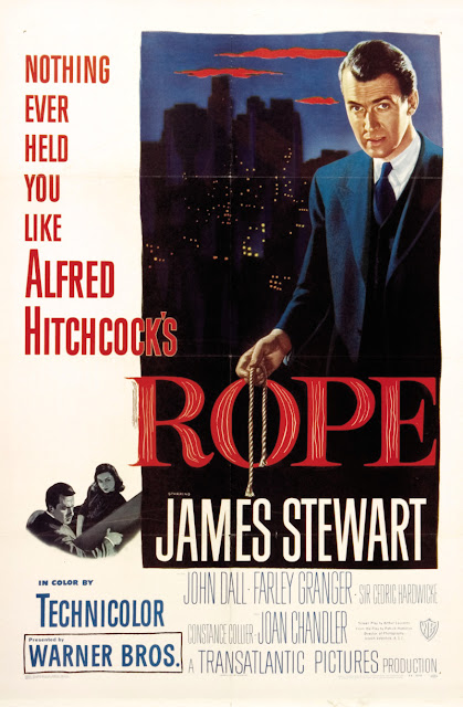
Alfred Hitchcock’s ‘Rope’ (1948) is a murder film, in which the murder takes place within the first three minutes. The film is based on a 1929 play by Patrick Hamilton, which is based on a real murder case from 1924 (Hutchinson, 2012). Fernando F. Croce of Slant comments on the moments immediately after the murder in which the main characters ‘recompose themselves as if awkwardly cleaning up post-coitus, complete with a was-it-good-for-you cigarette to soothe jangled nerves’ (Croce, 2006). Hitchcock was aware that the murderers in the 1924 case were lovers and, although unable to overtly show this in his film due to the time’s hostile attitudes to homosexuality, alluded to the same being true of his characters.
 |
| Fig. 1 Poster |
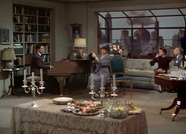
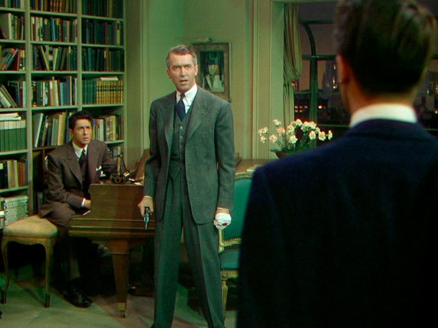
Hitchcock invites his audience to view the aftermath of Brandon and Phillip’s murder of their friend David, and their storing of his body in a chest in their apartment, off which they then serve dinner to David’s friends and family (as seen in Fig. 2). As Pamela Hutchinson, writing for The Guardian, comments, ‘Murder in the movies is usually more about motive than consequence’ (Hutchinson, 2012). Hitchcock instead uses the aftermath of the murder to build suspense; the audience know that Brandon and Philip are dangerously close to discovery at any moment throughout the film, they are just waiting for the inevitable. It is impressive that Hitchcock manages to engage the audience for the length of this film and it is his clever technical and creative choices that fill it with suspense.
 |
| Fig. 2 The Dinner |
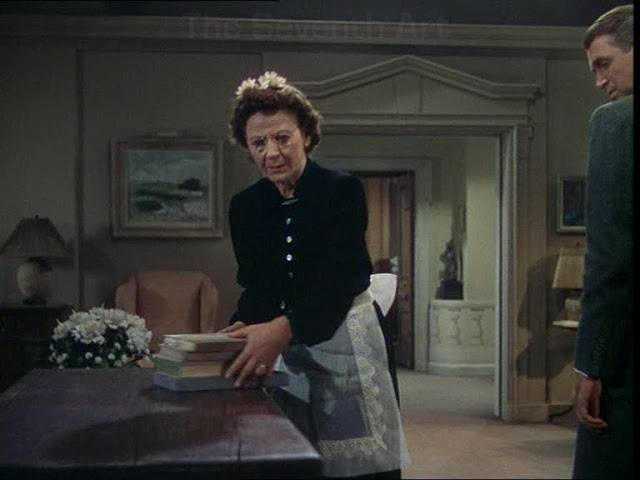
The audience must spend the majority for the film waiting for something they know will happen. Hitchcock tells the story in this way to build suspense and he keeps this going by moving the murder closer to discovery from several angles. As the murderers’ old tutor becomes suspicious, their housekeeper begins to clear off the chest in which David’s body is hidden. This is shown very cleverly, with a tense discussion about David’s possible whereabouts happening off screen on the right, as the camera remains still as she moves items off the chest a few at a time (as seen in Fig 3). It is only as she has begun to open the chest that we see other characters again as they move to stop her.
 |
| Fig. 3 The Close Call |
Hitchcock makes clever use of the camera in several ways, with particular shots such as the housekeeper clearing the chest, as well as shooting the film in as close as possible to one take. Hitchcock disguises cuts by ducking behind objects and characters, it is almost as though the film is shown from the continuous point of view of the audience as they stand inside the apartment, as, as Hutchinson comments, the film proceeds ‘excruciatingly close to real time’ (Hutchinson, 2012). The screen time and diegetic time do not match up completely but it is close enough that the audience experiences it as though they do. Croce comments that ‘Far from just “recording a play,” the suffocating long takes enforce ethical contemplation by refusing the relief of a cut (which, in the director’s voyeuristic world, would have amounted to looking the other away)’ (Croce, 2006). It serves to build suspense by trapping the audience in the narrative, keeping them waiting while making them feel as though something could happen at any moment.
Not everyone was a fan of this one-shot experiment; Bosley Crowther of The New York Times wrote that ‘the method is neither effective nor does it appear that it could be’ (Crowther, 1948). Despite this Crowther did note that ‘Mr. Hitchcock has followed the goings and the comings of characters with evident ingenuity. His camera stands back and takes them in, singles them out on occasion and even moves in now and then for close looks’ (Crowther, 1948). This is particularly impressive considering the size of colour cameras at the time. The set needed to be designed in a way that allowed for the camera to move as Hitchcock needed it to. In his book ‘The Wrong House: The Architecture of Alfred of Hitchcock’ (2007), Steven Jacobs describes how ‘wild walls hung from heavily greased overhead U-tracks so that grips could pull them silently out of the camera’s way as it followed the actors through doors, then roll them back into position before they came back into camera range’ (Jacobs, 2007:274). The furniture was similar, with some of it on wheels so that it could be easily moved out of the camera’s way.
 |
| Fig. 4 The Backdrop |
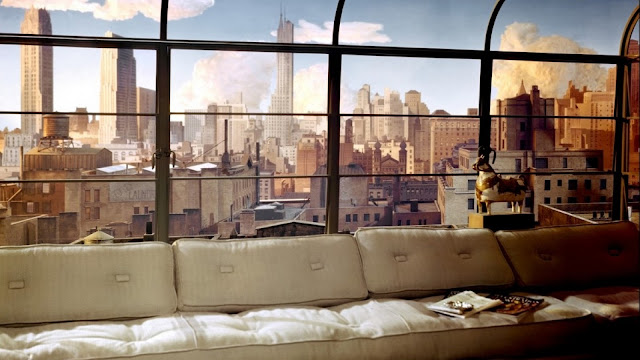
The backdrop (as shown in Fig. 4) of the was an important element of film, particularly as Hitchcock needed a moving sun that kept with the diegetic time of the film. An 80ft semicircle model of the New York skyline was built with some buildings in three dimensions and some flat ones in the back. Steam chimneys were used with dry ice used to slow it down and make it look like far away smoke. This has a very impressive effect and the design of the set allows for this back drop to be in many of the shots throughout the film with the sun moving at the right speed to make it look like real time. Christopher Null of Contact Music describes the set design as ‘gloriously complicated’ (Null, s.d.). Hitchcock was meticulous, calling in a meteorologist to check the accuracy of his spun glass clouds and using individually wired lights to be turned out gradually as the evening progressed (Jacobs, 2007:272-276). Lighting is a very important part of the mis-en-scene towards the end of the film, as neon lights flash red and green into the apartment (as shown in Fig. 5). This is very dramatic and adds an unnatural atmosphere to the apartment as everything comes to a head. The red and green are very different from anything seen in the rest of the film and they work well to add drama to the final scene.
 |
| Fig. 5 Neon Lights |
Bibliography:
Croce, F (2006). Rope. At: http://www.slantmagazine.com/film/review/rope (Accessed on 10.02.17)
Crowther, B (1948). THE SCREEN IN REVIEW; ' Rope,' an Exercise in Suspense Directed by Alfred Hitchcock, Is New Bill at the Globe. At: http://www.nytimes.com/movie/review?res=980DE3D81630E03BBC4F51DFBE668383659EDE (Accessed on 10.02.17)
Hutchinson, P (2012). My favourite Hitchcock: Rope. At: https://www.theguardian.com/film/filmblog/2012/jul/27/my-favourite-hitchcock-rope (Accessed on 10.02.17)
Jacobs, S (2007). The Wrong House: The Architecture of Alfred Hitchcock. Rotterdam: 010 Publishers. Online At: https://books.google.co.uk/books?hl=en&lr=&id=rIDVqjD6SZIC&oi=fnd&pg=PA8&dq=rope+hitchcock&ots=El631tyQrX&sig=gNeuADAeIK4HaSulBRBsor3uYOQ#v=onepage&q&f=false (Accessed on 10.02.17)
Null, C (s.d.). Rope. At: http://www.contactmusic.com/film/review/rope (Accessed on 10.02.17)
Illustration List:
Fig. 1 Poster
Hitchcock, A (1948). Rope. [Poster] At: https://thejar.hitchcock.zone/files/gallery/org/338.jpg (Accessed on 15.02.17)
Fig. 2 The Dinner
Hitchcock, A (1948). Rope. [Film Still] At: https://blogger.googleusercontent.com/img/b/R29vZ2xl/AVvXsEh914mPWlp93ZCefL7CI24lW6Gaxdxabbl81_VPnfZf71I78bRS0uaerhLpNd-w1IrdHJ0Ec4Zi4pvkDgF_16FEHJhWZdpRiPCgOgCb9smUzFo3_CBruGX_4Jr2ZA_2C_vSnb8opyIDMwo/s1600/Rope_still_4.jpg (Accessed on 15.02.17)
Fig. 3 The Close Call
Hitchcock, A (1948). Rope. [Film Still] At: https://theseventhart.files.wordpress.com/2010/04/rope.jpg (Accessed on 15.02.17)
Fig. 4 The Backdrop
Hitchcock, A (1948). Rope. [Film Still] At: https://image.tmdb.org/t/p/original/dInCDTVbnD4x7eOUMRZnDRjHCEr.jpg (Accessed on 15.02.17)
Fig. 5 Neon Lights
Hitchcock, A (1948). Rope. [Film Still] At: https://s-media-cache-ak0.pinimg.com/736x/fb/ea/53/fbea5392a8e934d160d87832f66ab17b.jpg (Accessed on 15.02.17)


